Workflow
Overview
BI Analyst provides a conversational approach to creating data visualizations. Users upload their data files and interact with the system through natural language to generate and refine charts.
Step-by-Step Workflow
Step 1: Data Upload
- File Upload: Upload your CSV or Excel file to the platform
- Supported Formats: CSV and Excel (.xlsx, .xls) files only
- Data Processing: System automatically parses your file and analyzes the data structure
- Data Validation: Basic validation ensures data quality for visualization
Step 2: Chart Request
User describes visualization requirements and receives AI-generated chart suggestions
- Natural Language: Describe the chart you want using everyday language
- Be Specific: Include details about what data columns to use and chart type preferences
- Context Provided: Mention the purpose or audience for the visualization
Example Requests:
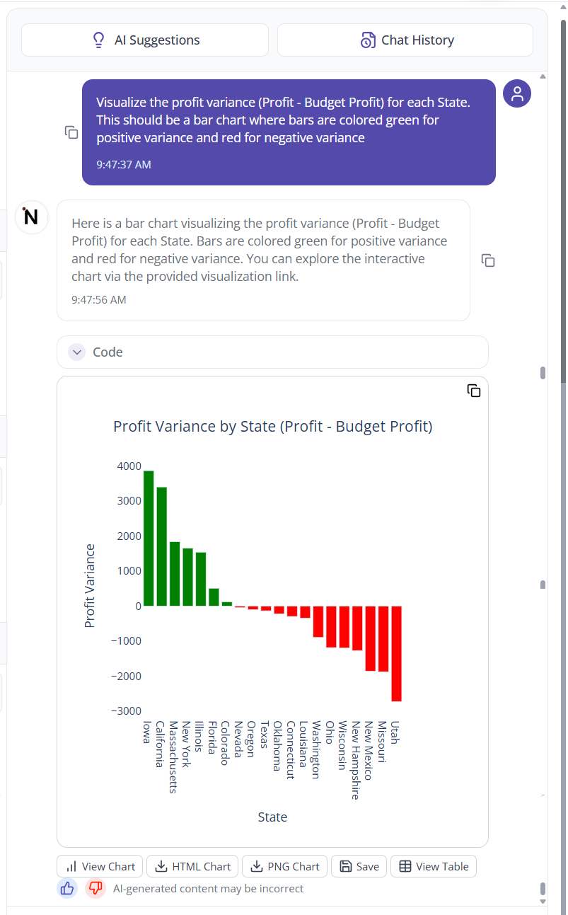
"Create a bar chart showing sales by region"
"Show monthly revenue trends as a line chart"
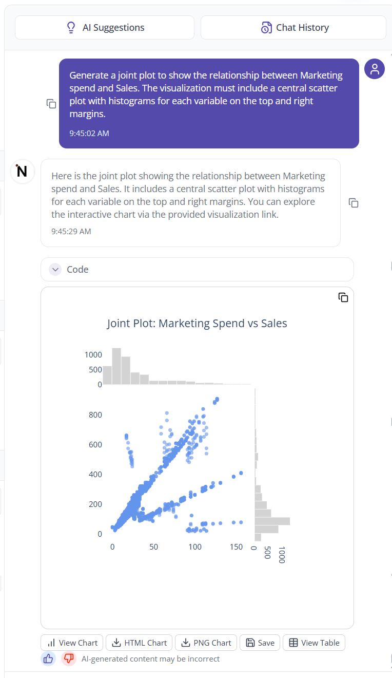
"Generate a scatter plot of price vs quantity sold"
"Make a pie chart of product categories by revenue"
Step 3: Chart Generation
- SAM Processing: The SAM framework analyzes your request and data
- Chart Selection: System determines the most appropriate visualization type
- Professional Styling: Automatic application of clean formatting and colors
- Chart Creation: Generate the visualization based on your specifications
Step 4: Chart Interaction
- Hover Details: Move your mouse over chart elements to see specific data values
- Data Exploration: Click on different parts of the chart to explore data points
- Visual Analysis: Use the chart to identify patterns and insights in your data
Step 5: Chart Modification
User modifies chart styling, data filters, and chart types through natural language requests
All modifications are done through additional prompts to the system:
Style Changes:
- "Change the bars to blue color"
- "Make the chart title larger"
- "Add data labels to the bars"
Data Adjustments:
- "Filter to show only Q4 data"
- "Group the data by month instead of week"
- "Show only the top 10 categories"
Chart Type Changes:
- "Convert this to a horizontal bar chart"
- "Show this data as a pie chart instead"
- "Create a line chart with the same data"
Step 6: Export and Use
- PNG Export: Download your finished chart as a high-resolution PNG image
- Professional Quality: Charts are suitable for presentations, reports, and documents
- Ready to Use: Downloaded images can be used immediately in your business materials
Getting Started Tips
Effective Chart Requests
- Be Clear: Specify which columns to use for x-axis, y-axis, and grouping
- State Purpose: Mention if it's for a presentation, report, or analysis
- Include Filters: Specify any data filtering requirements upfront
Working with Data
- Clean Data: Ensure your data is properly formatted with clear column headers
- Data Types: Make sure numeric columns contain numbers and date columns are formatted correctly
- Column Names: Use descriptive column headers for better chart labeling
AI Prompt Recommendations
When you start working with new data, the system provides:
- Suggested Prompts: Examples of charts that work well with your data structure
- Data Insights: Basic information about what the system found in your data
- Chart Recommendations: Suggestions for effective ways to visualize your specific dataset
Chart Modification Through Prompts
Filtering Data
- Use prompts to focus on specific time periods, categories, or value ranges
- Request comparisons between different segments of your data
- Ask for top/bottom performers or specific data subsets
Drilling Down
- Request more detailed views of specific data points
- Ask for breakdowns by additional dimensions
- Explore different time periods or categories through follow-up questions
Style and Format Changes
- Modify colors, fonts, and layout through conversational requests
- Adjust chart titles, axis labels, and legends
- Request different chart orientations or arrangements