ChatWithCharts
Overview
BI Analyst generates charts through the SAM framework based on your data characteristics and natural language requests. The system analyzes your data and creates appropriate visualizations that match your requirements.
Chart Generation Process
SAM Framework
- Data Analysis: System examines your data structure and content
- Chart Selection: AI determines the most appropriate visualization type
- Professional Styling: Automatic application of clean, readable formatting
- Context Awareness: Understands the purpose behind your visualization request
Available Chart Types
Statistical Charts
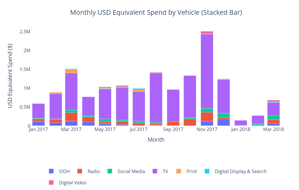
- Bar Charts: Category comparisons and rankings
- Line Charts: Trends and changes over time
- Scatter Plots: Relationships between two variables
- Histograms: Data distribution analysis
- Box Plots: Statistical distribution and outlier identification
Business Charts
- Pie Charts: Part-to-whole relationships
- Area Charts: Cumulative values over time
- Heatmaps: Pattern recognition in two-dimensional data
- Bubble Charts: Three-dimensional data relationships
Specialized Visualizations
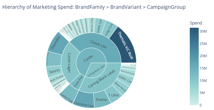
- Treemap Charts: Hierarchical data, proportional representation
- Waterfall Charts: Financial analysis, variance breakdown
- Funnel Charts: drop-off analysis, stage comparisons
- Sankey Diagrams: Flow analysis, process visualization
Chart Features
 Interactive chart displaying hover functionality, data exploration features, and comprehensive chart capabilities
Interactive Elements
- Hover Details: View specific data points by hovering over chart elements
- Data Exploration: Get detailed information about individual values
Chart Modification
- Prompt-Based Editing: Request changes through natural language
- Style Adjustments: Modify colors, labels, and formatting through additional prompts
- Chart Type Changes: Switch between different visualization types as needed
- Data Filtering: Filter and focus on specific data subsets through prompts
Chart Selection Intelligence
Automatic Recommendations
The system considers several factors when suggesting chart types:
- Data Types: Categorical vs numerical data
- Data Volume: Small vs large datasets
- Intended Purpose: Comparison, trend analysis, or distribution
- Best Practices: Visualization principles for clarity and impact
User Guidance
- Smart Prompts: AI provides suggestion prompts when you start working with data
- Chart Examples: System can suggest different ways to visualize your data
- Optimization Tips: Recommendations for improving chart clarity and impact
Export Options
 Professional-quality chart showing export capabilities, formatting options, and presentation-ready output
PNG Export
- High Resolution: Professional quality images suitable for presentations
- Standard Format: Compatible with all document and presentation software
- Download Ready: Direct download of generated visualizations
Getting Insights from Charts
Data Understanding
- Pattern Recognition: Identify trends and patterns in your visualizations
- Data Stories: Charts help reveal insights hidden in raw data
- Visual Analysis: Use charts to better understand your business metrics
Prompt for Insights
- Ask Questions: Request explanations about what your charts show
- Drill Down: Use additional prompts to explore specific aspects of your data
- Comparative Analysis: Generate multiple charts to compare different aspects